Industrial Software
Design System Audit
Convert UI components attributes into KPI, to address the current state of design system library, and prioritise efforts

Overview
When a library develops organically and each designer has equal rights to add and modify components, it’s only a matter of time before the integrity disappears. Not just visually, but also in terms of quality.
Before attempting to fix this, it is necessary to plan your actions. You can review Figma files and leave comments as much as you want, but in such tasks, there is nothing better than a systematic approach.
The Rating System
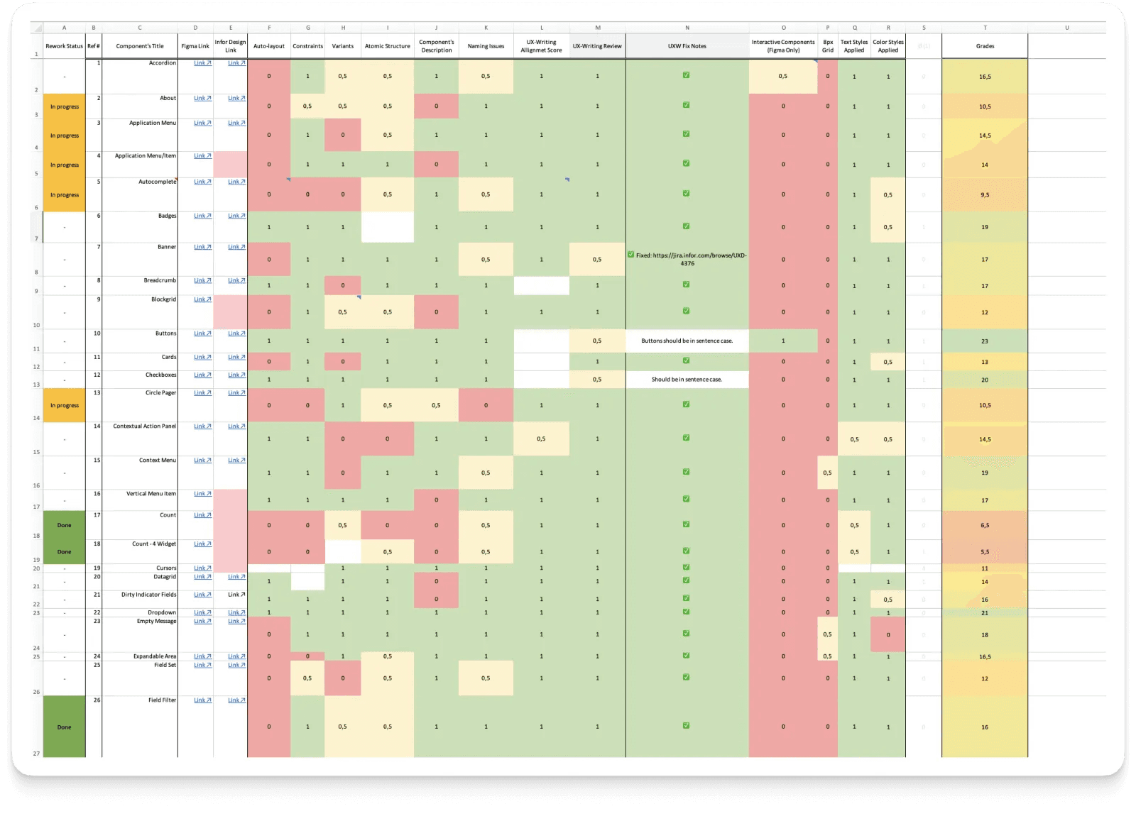
Faced with such a situation, we brainstormed and decided to work in Excel — a well-known tool that everyone in the team is familiar with and can easily use.
We reviewed the components and compiled a list of attributes/parameters necessary for effective work with them. We also noted that the mere presence of attributes is insufficient — they must follow industry standards.
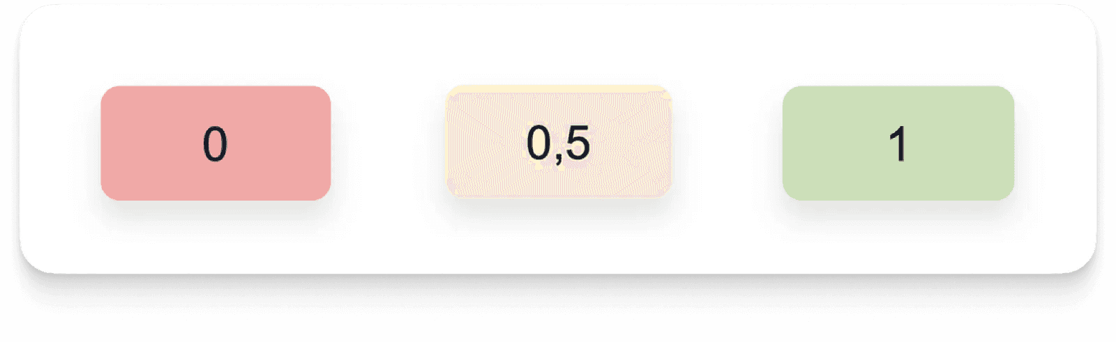
Hence, the rating system:
- 0 — Does not follow standards
- 0.5 — Partially follows, and there are things that need to be corrected
- 1 — Everything is in order
When an attribute is not necessary for a particular component, it is counted as 1.
Mechanical Work
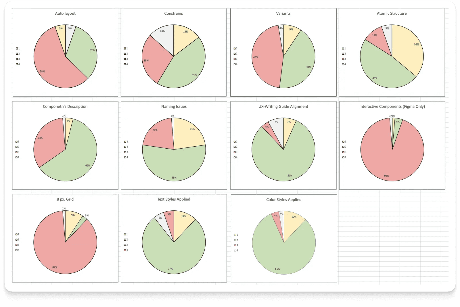
All 75 components were reviewed and evaluated, and the results for attributes were translated into a visual infographic.
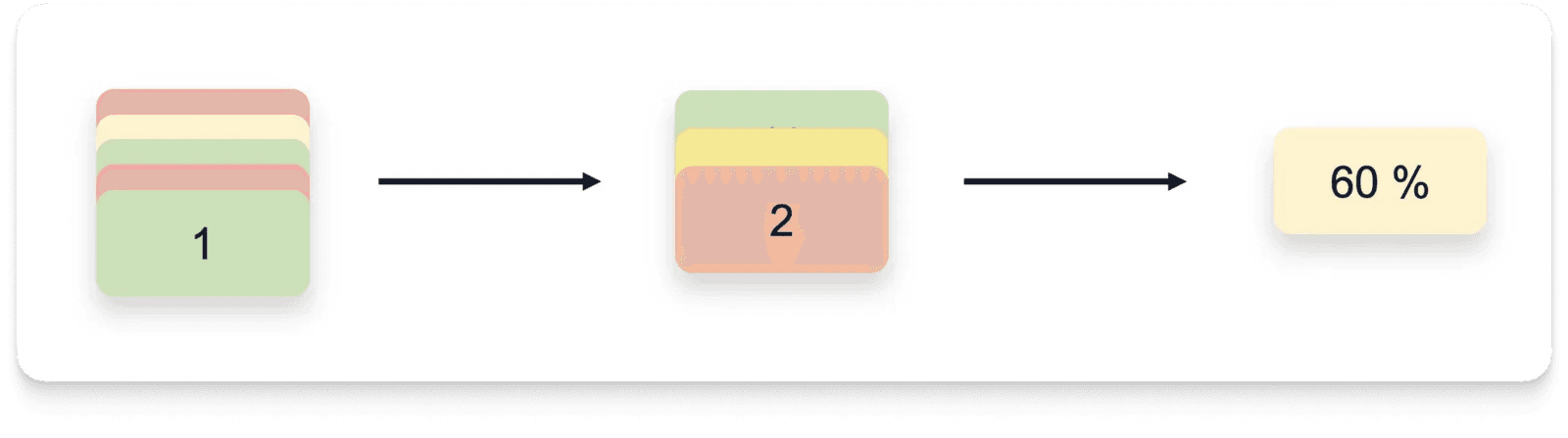
An initiative was taken to consolidate the results into a single KPI that would reflect the overall picture, making communication with management easier. The principle is simple:
- We calculate the sum and obtain the component’s rating.
- We calculate the arithmetic mean of all ratings and convert it into a percentage.
- Voila, we have the “Readiness Index” of the library for effective use.
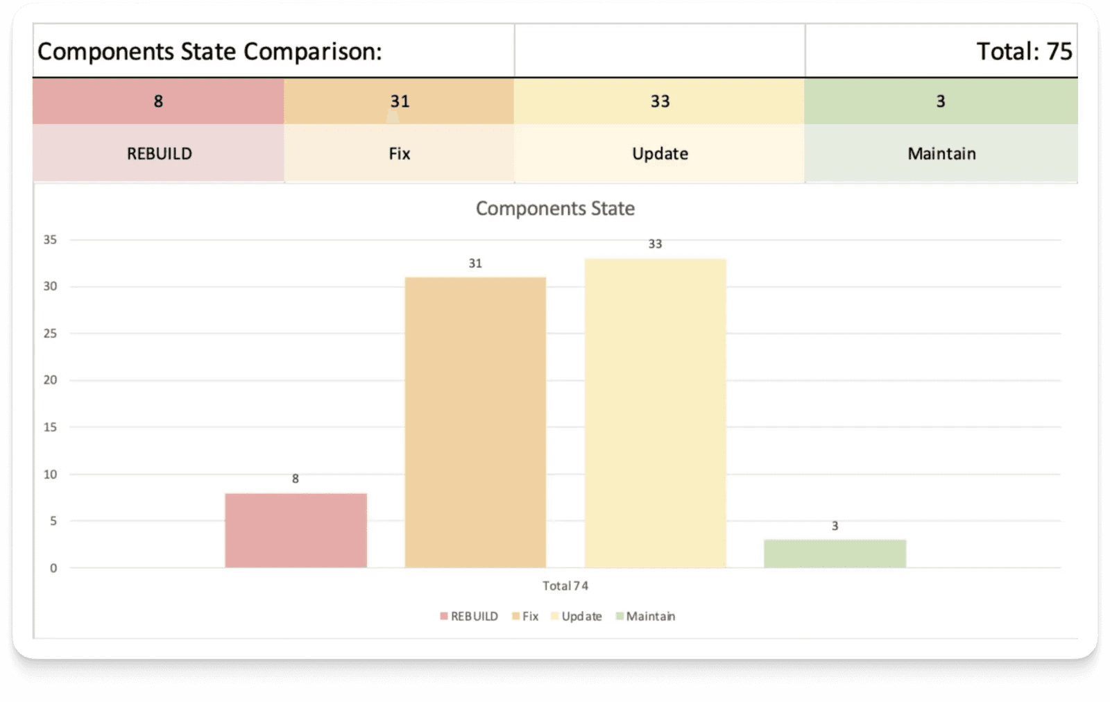
To further complement the picture, we sorted the components by ratings into 4 groups. This is practically prioritization of work — it shows its scope, and highlighting the most problematic components indicates what to tackle first.
How Can We Improve This Method?
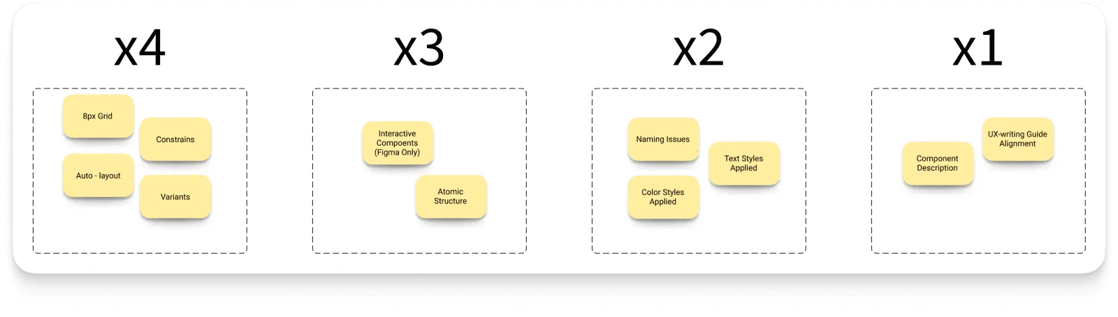
Fair distribution of points among attributes. In our case, all attributes had equal weight, and that’s not right. For example, without a component description, the interface won’t break with autolayout, but not vice versa.
So, together with the design team, we conducted a quick card-sorting and assigned higher coefficients to more significant attributes. As a result, the readiness index moved significantly away from the ideal, but approached reality: 57% → 43%.
Summary
What started as a small experiment has turned into a tool with great potential, namely:
- Live backlog — The most problematic components are clearly visible, which helps with prioritization and focus. By fixing components, the index is adjusted — the impact on the collective result is immediately visible.
- Collaboration — If you have a UX writing specialist in your company, invite them to the file and allow them to evaluate components in their field.
- KPIs — Convenient to use when communicating with management and justifying the distribution of efforts.
- Framework — This method can be applied to other libraries as well — it will be much faster.