Digital Adoption Toolset
Helping content managers create smarter in-app guidance for complex enterprise systems.
Overview
Over two years, I helped evolve the Userlane Editor from a relatively simple authoring tool into a more flexible system for creating contextual in-app guidance. The work focused on giving Content Managers better ways to support users inside complex enterprise software without requiring technical knowledge or developer support.
Context
Userlane is a digital adoption platform that helps companies guide users through complex software directly within the product experience, while also collecting behavioral insights that teams can use to improve user’s performance.
Userlane serves two main audiences:
- Admins – managing analytics, permissions, and account settings
- Content Managers – creating in-app guidance experiences
When I joined, the Editor supported three content types:
- Guides
- Tooltips
- Tags
A major limitation was that configuring many of these required jumping into a separate Portal used for analytics and admin settings. Even simple workflows forced Content Managers to constantly switch between surfaces.
The Editor worked, but it still felt like a collection of disconnected tools rather than a cohesive workspace.

Day one: the Editor shipped three content types — Guides, Tooltips, Tags.
What We Shipped
Across two years, the team introduced several capabilities that gradually turned the Editor into a more complete operating system for digital adoption.
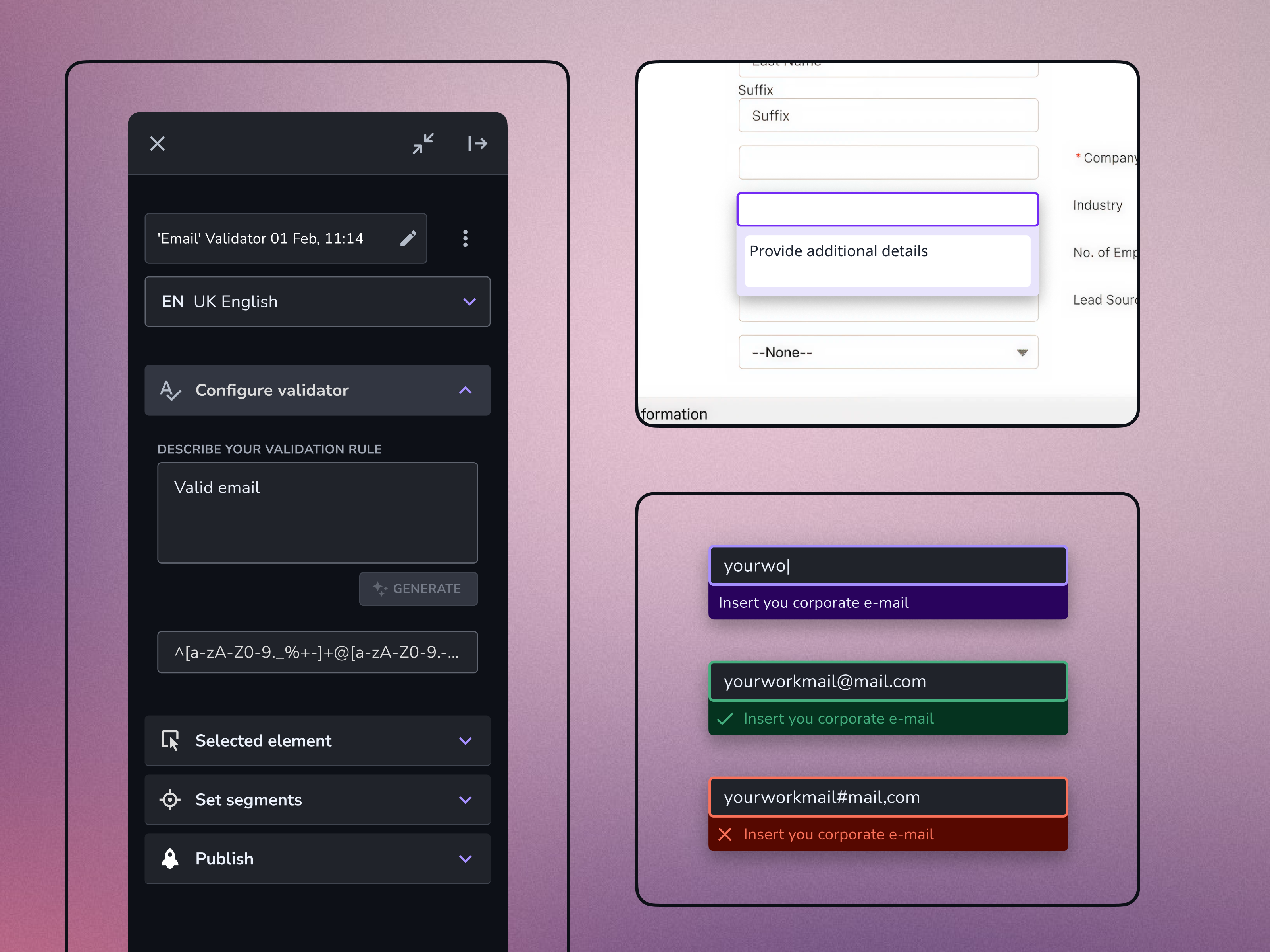
Input Validators
Validation layers for forms and inputs, including rule-based form validation for high-risk flows such as medical equipment configuration.
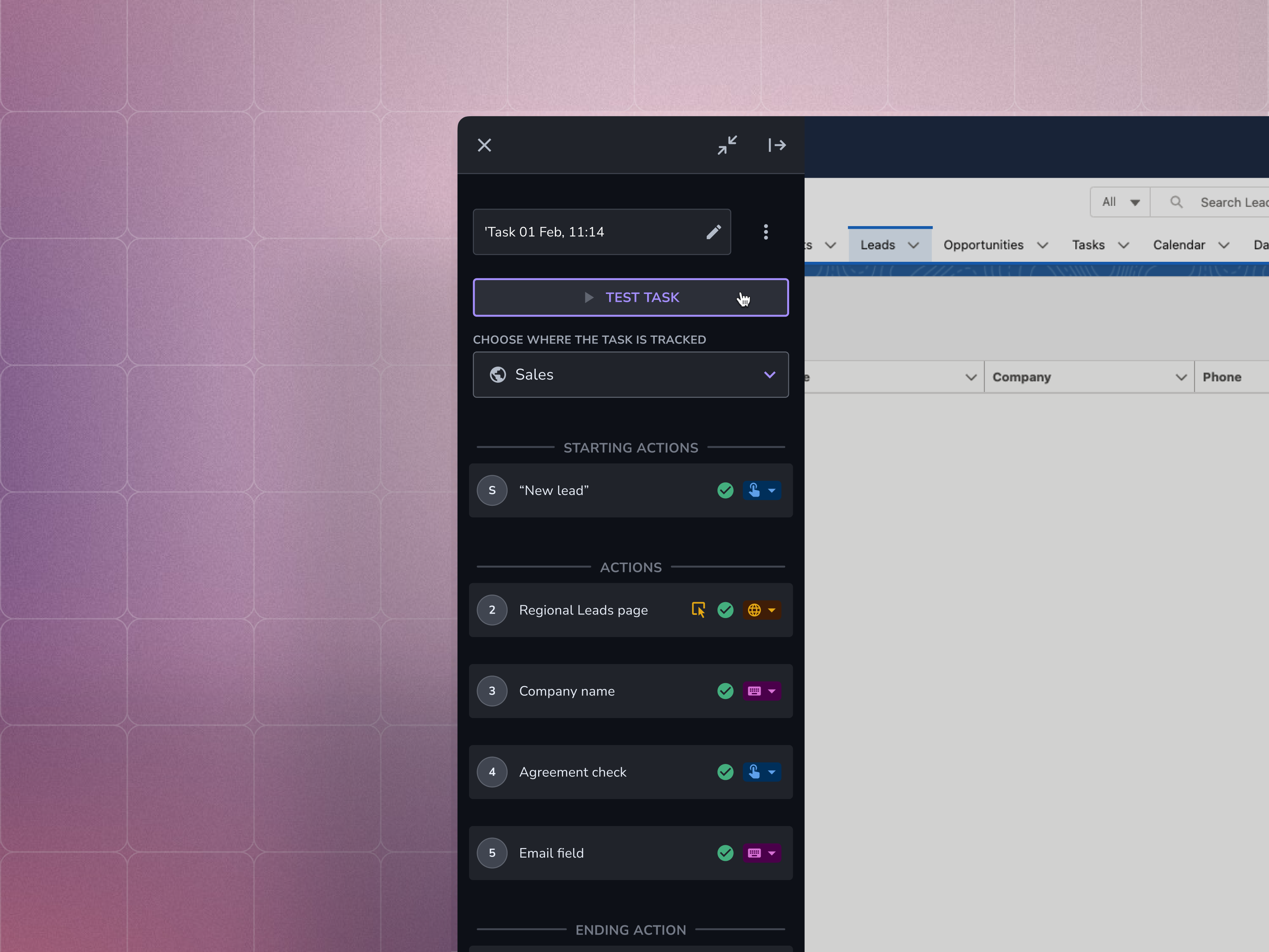
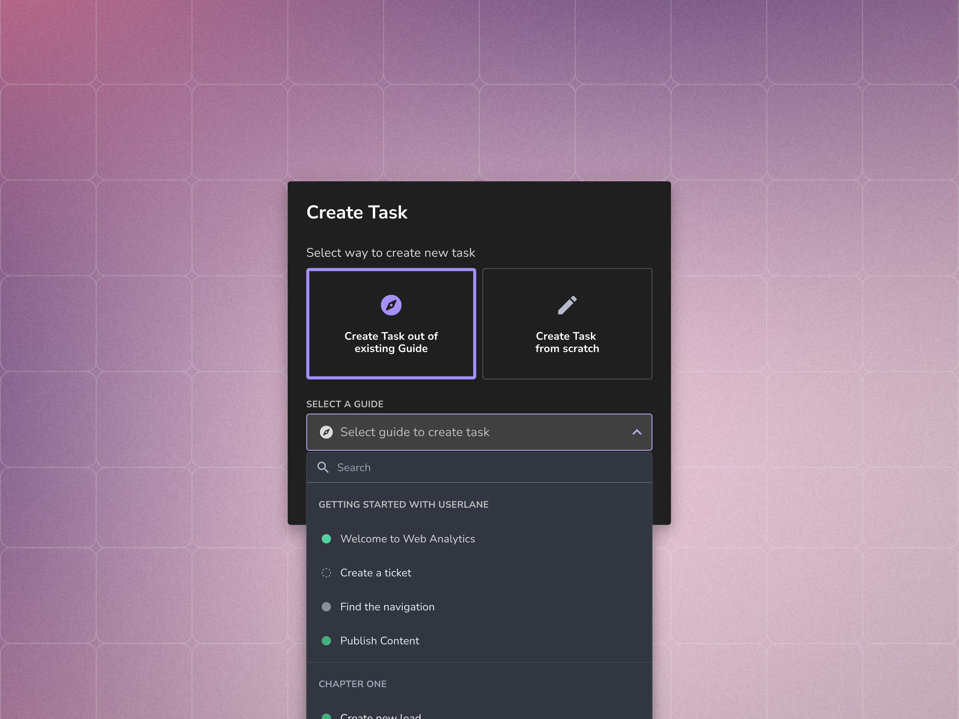
User Flow Trackers
Tools that allowed Content Managers to define user journeys and measure completion across workflows.
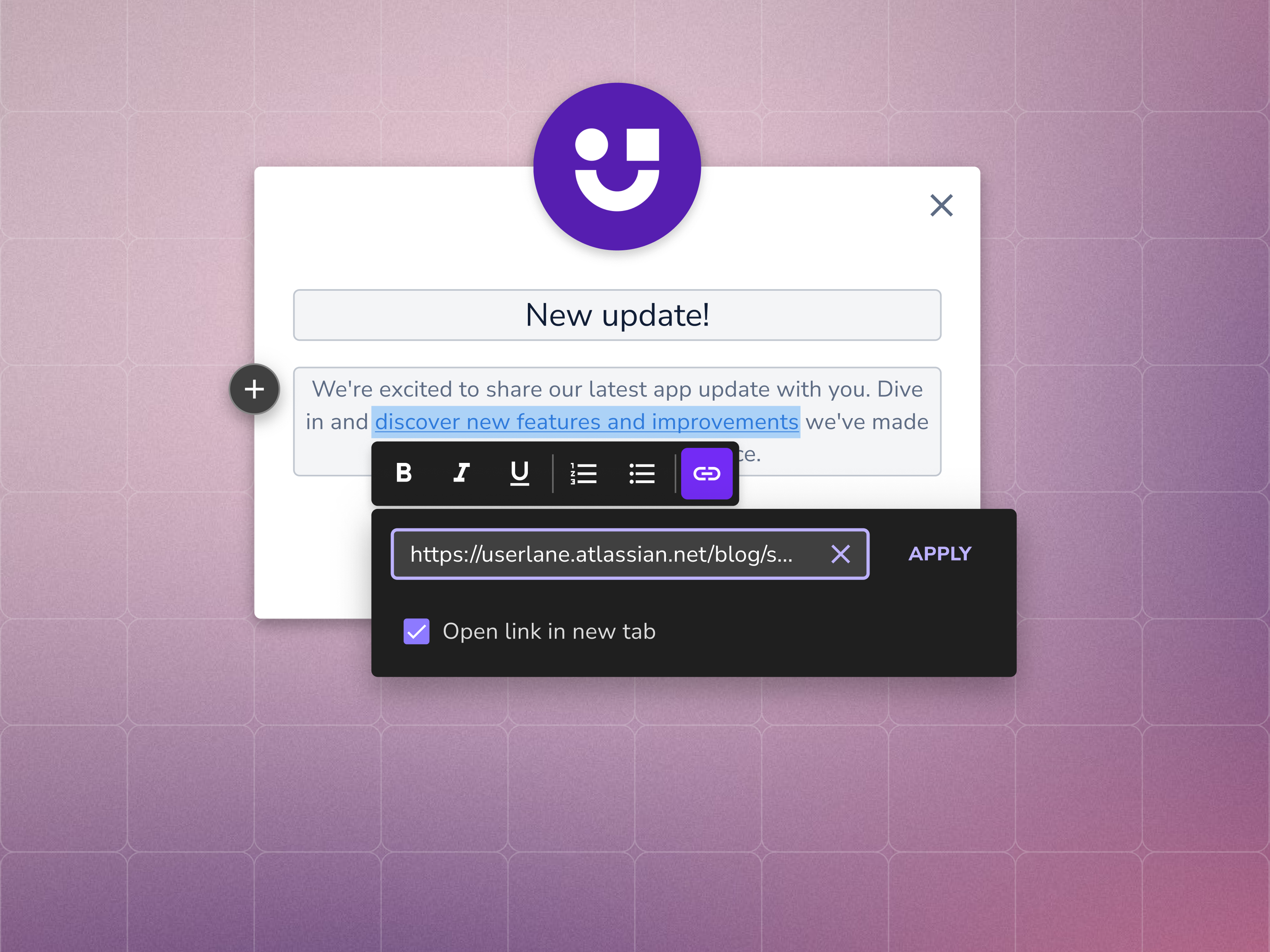
Rich Text Formatting
Support for structured content inside Guides, including headings, lists, links, and emphasis.
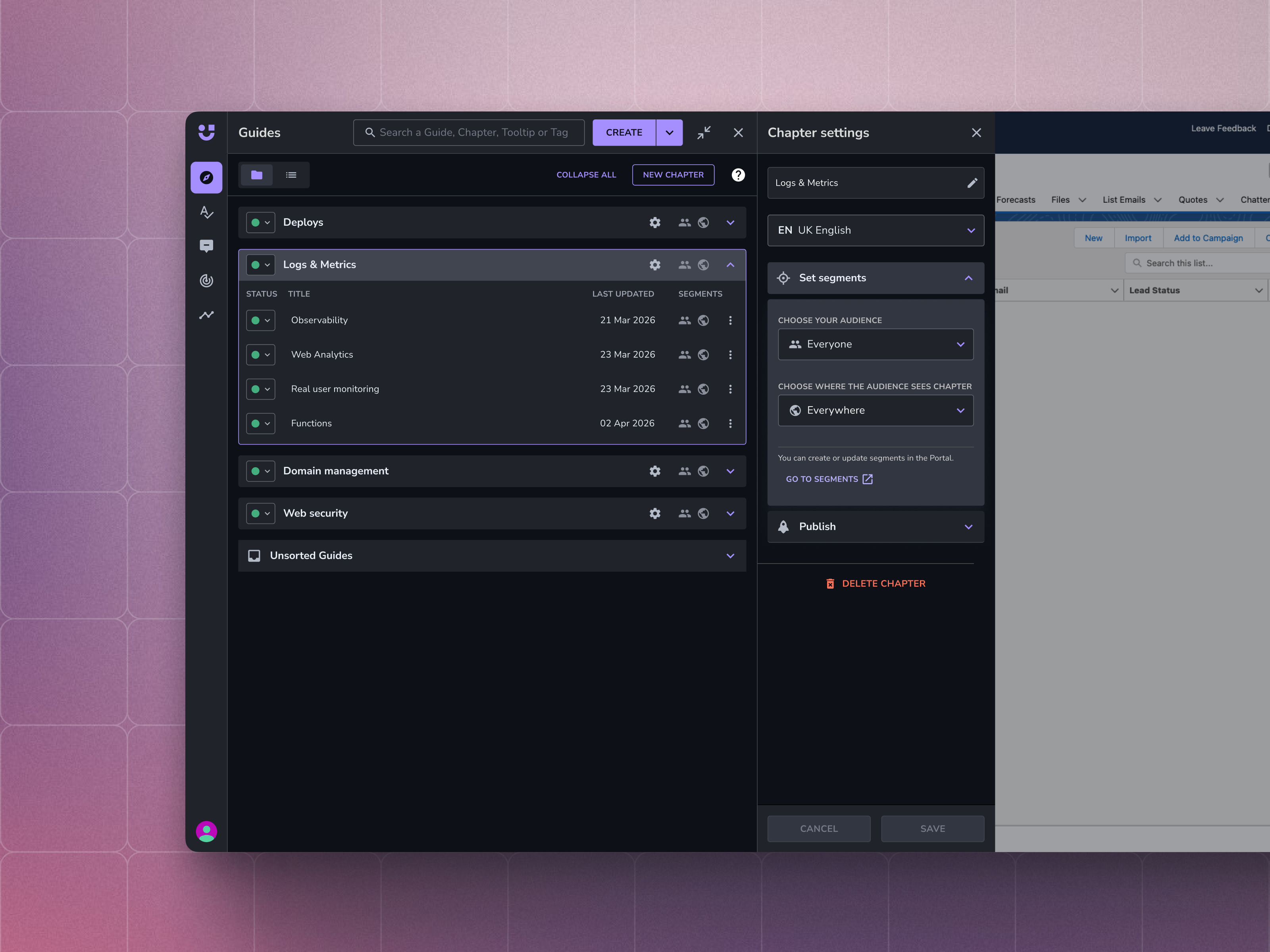
Guide Group Settings
Moved configuration directly into the Editor, removing one of the most repetitive context-switching pain points.
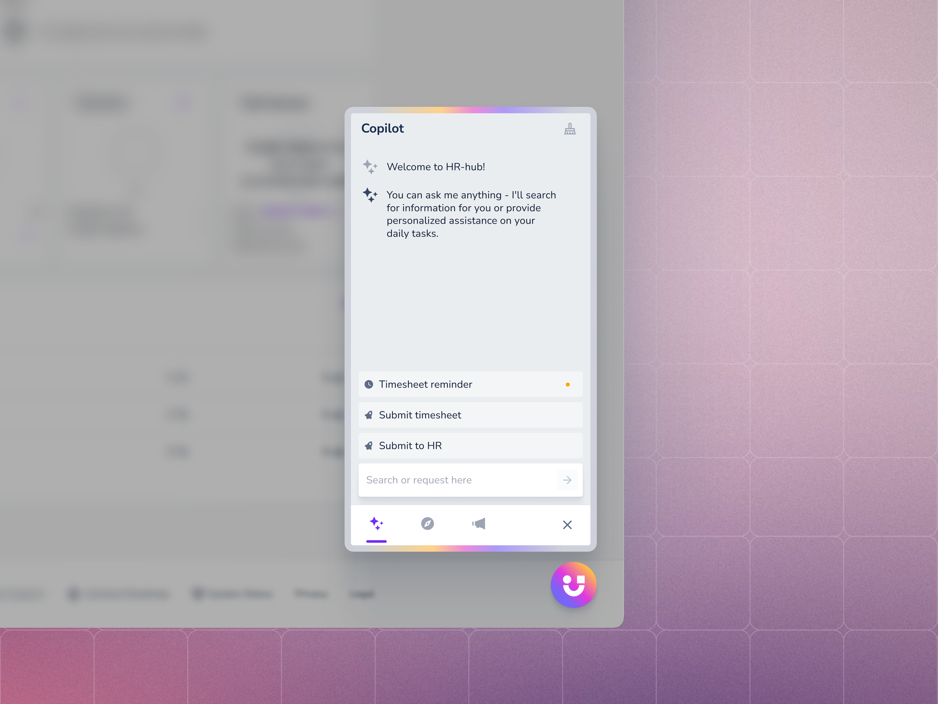
AI Assistant Chat
An AI-powered assistant that lets end users request guides or documentation directly through chat.
Case: Contextual Actions
The Problem
Customers wanted guidance that could respond to behaviour – not just appear on page load.
Existing content types were mostly static - Guides, Tooltips, and Tags could appear in predefined places, but they couldn’t adapt dynamically to what users were actually doing.
Customer interviews repeatedly surfaced the same underlying need:
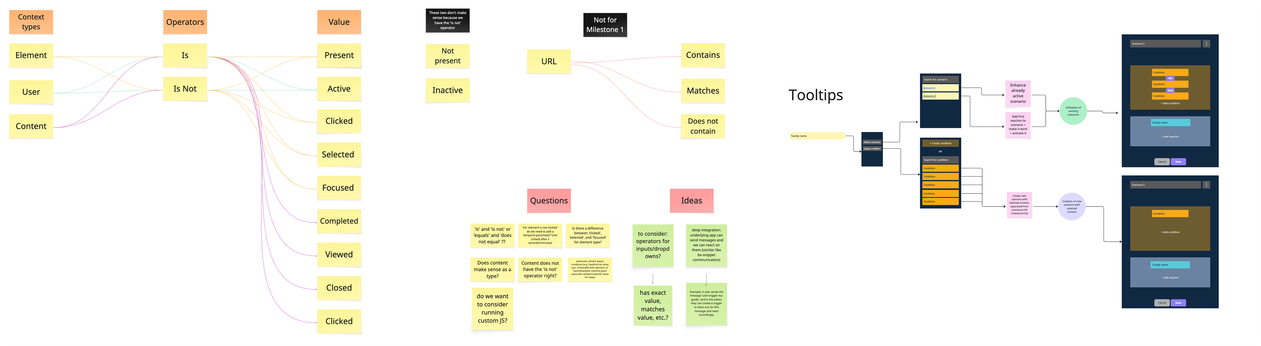
“I want to create all the conditions that come into my head… pieces of LEGO, and then I click add condition and pull from my LEGO stack.”
The insight was simple:
Content Managers already had the pieces. They just needed a way to combine them.
Research & Collaboration
The feature took shape through:
- 5 CSM interviews
- 3 customer interviews
- Weekly trio reviews with engineering
- Validation sessions with Customer Success teams
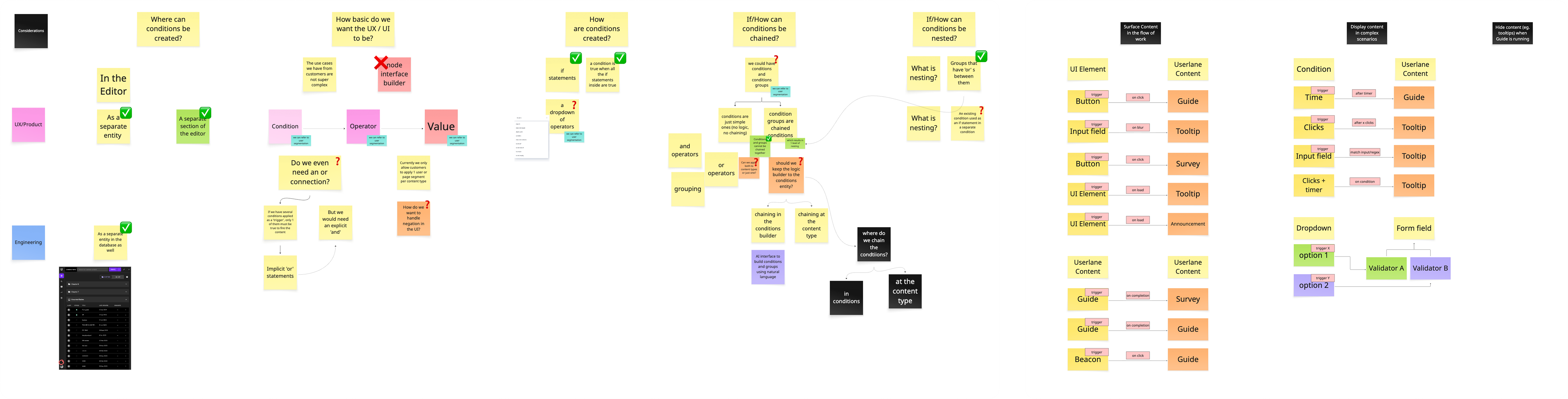
My role focused on:
- UX exploration and iterations
- Customer interview participation
- Information architecture
- Naming evolution
- Defining the V1 → V2 interaction model
The PM drove prioritization and product strategy, while engineering helped shape feasibility throughout discovery.
Constraints
- Content Managers were not technical users
- Existing guidance models were built around static triggers
- The team had limited bandwidth for design system maintenance during development
- We needed to give users flexibility without overwhelming them
Early Direction
The feature went through multiple naming explorations before landing on Contextual Actions.
- “Scenarios” sounded too close to marketing automation
- “Triggers” felt too technical
- “Contextual Actions” matched the language Customer Success teams already used with customers
That mattered because the feature wasn’t just another setting – it became its own content object alongside Guides, Tooltips, and Tags.
Architectural Decision
One important product decision was treating Contextual Actions as a standalone object inside the Create menu rather than attaching triggers onto existing content types.
We chose this direction because:
- One Contextual Action could reference multiple pieces of content
- Customers already thought about it as a separate thing
- Placing it directly in the Create menu made it easier to find and understand
Keeping the model flat also reduced hidden configuration states.
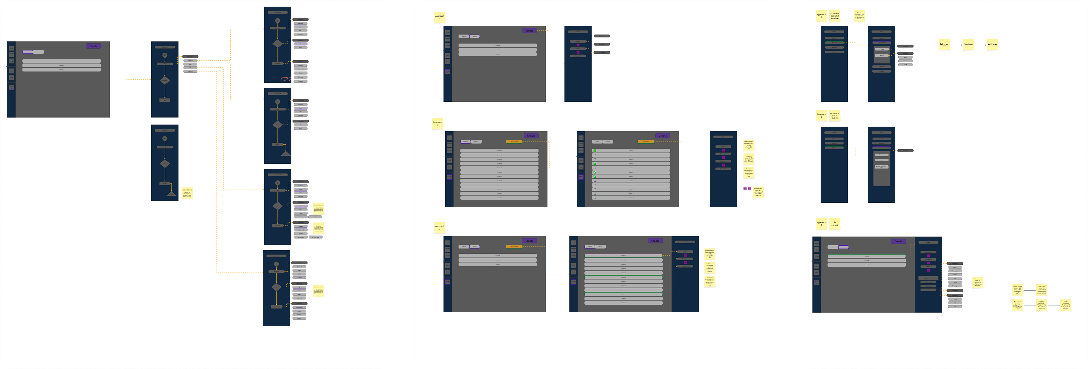
V1 – Rejected
The first concept used a single-column layout where conditions and actions were stacked together and It became overwhelming immediately.
As soon as more realistic use cases entered the flow – multiple conditions, multiple actions, parameter controls – the interface became difficult to scan and navigate througth.
The structure simply didn’t scale.
V1: condition and content stacked in a single column. Killed because it couldn’t compose.
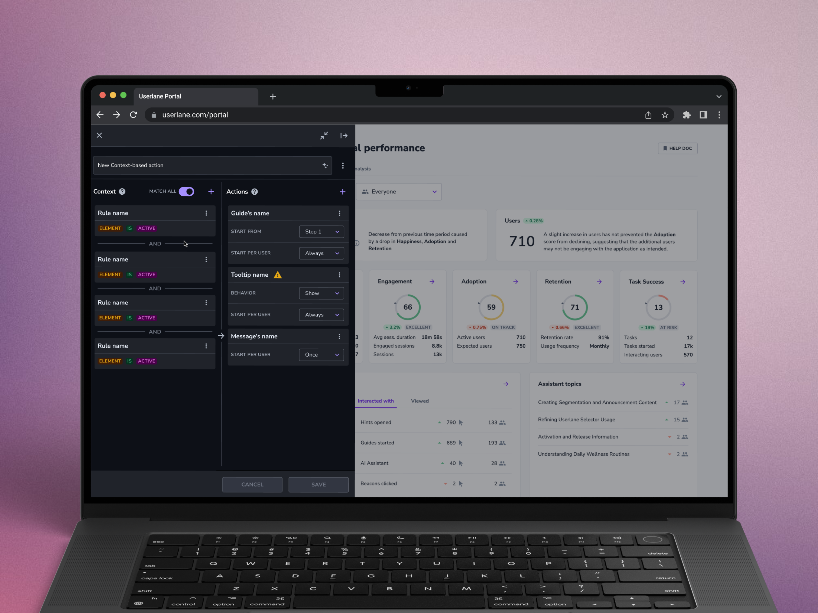
V2 – Shipped Direction
The shipped approach separated logic into two clear areas:
- Left side: conditions and behavioural rules
- Right side: resulting actions and content
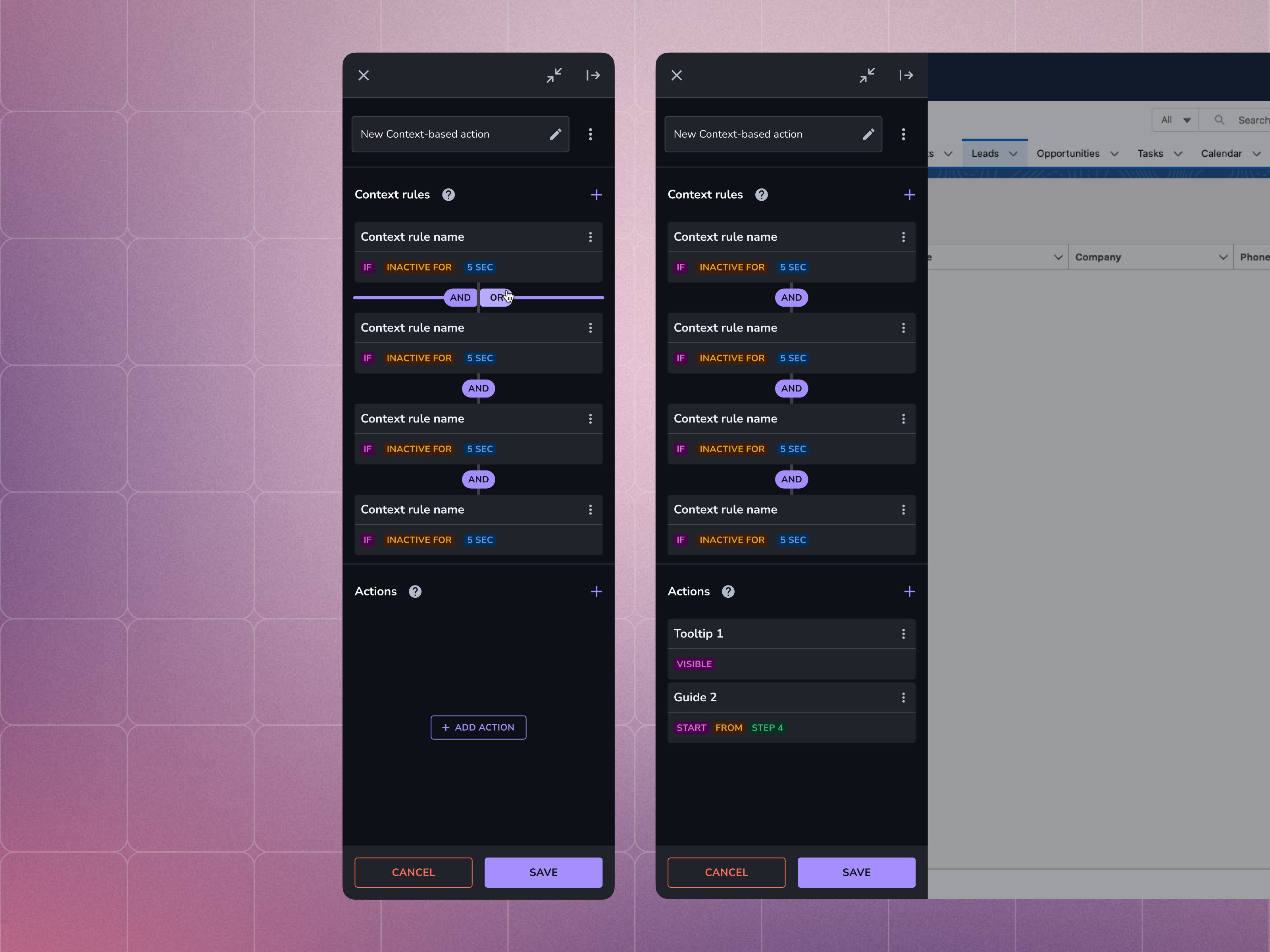
We introduced a simple MATCH ALL toggle for AND/OR logic instead of exposing users to complex nested rule builders. This structure worked because it aligned with the mental model customers already described themselves: modular, composable building blocks. And given a fact that user mostly reuse existing content in for of actions - we were allowed to take more from horizontal space - Content Manager doesn’t need to see underlying app during Contextual action composition.
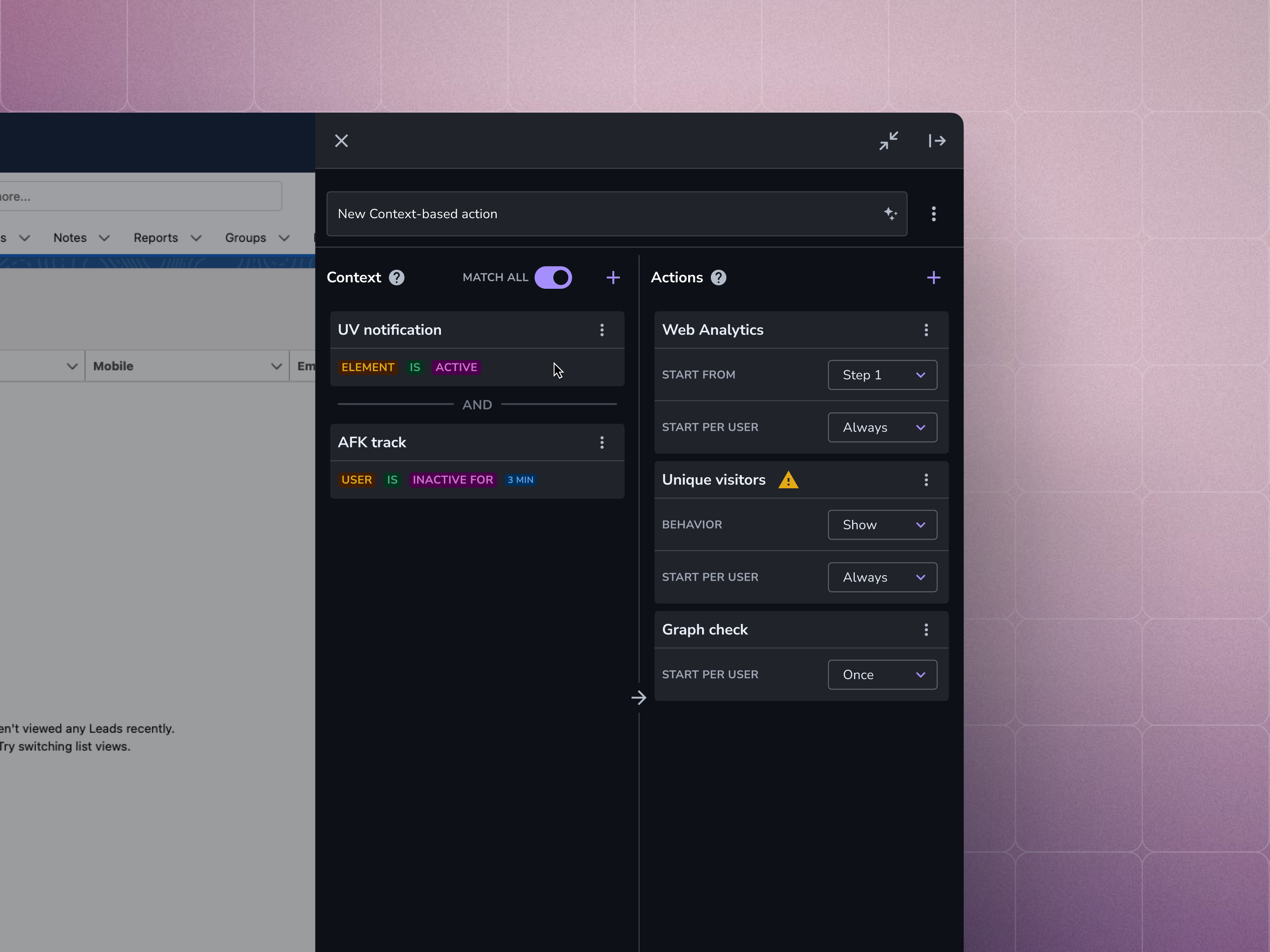
Shipped: two-column Context | Actions. Left = rules, Right = actions. MATCH ALL toggle handles AND/OR without nested groups.
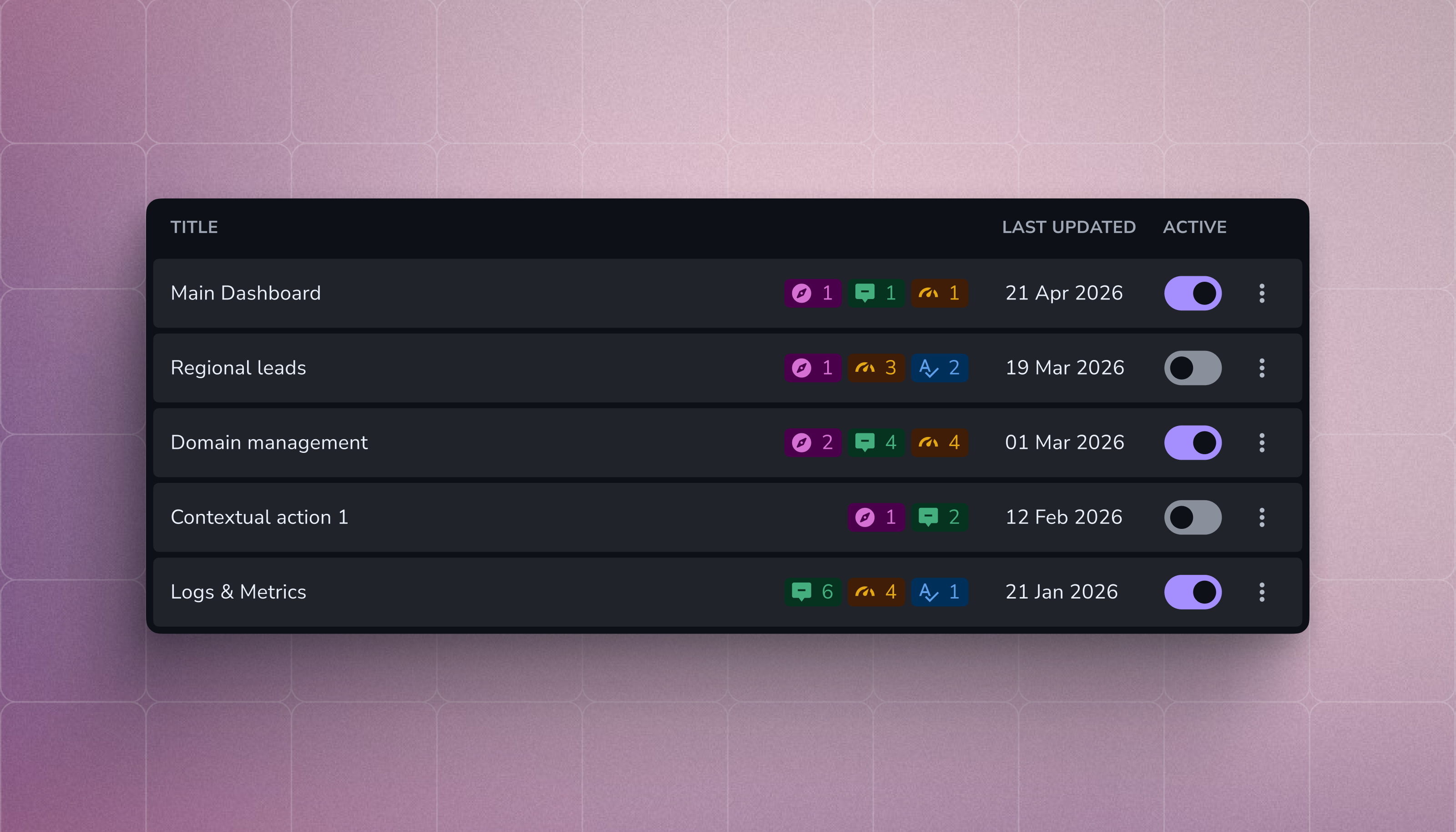
Contextual Actions list view — peer to Guides, Tooltips, Tags, Tasks in the Create menu.
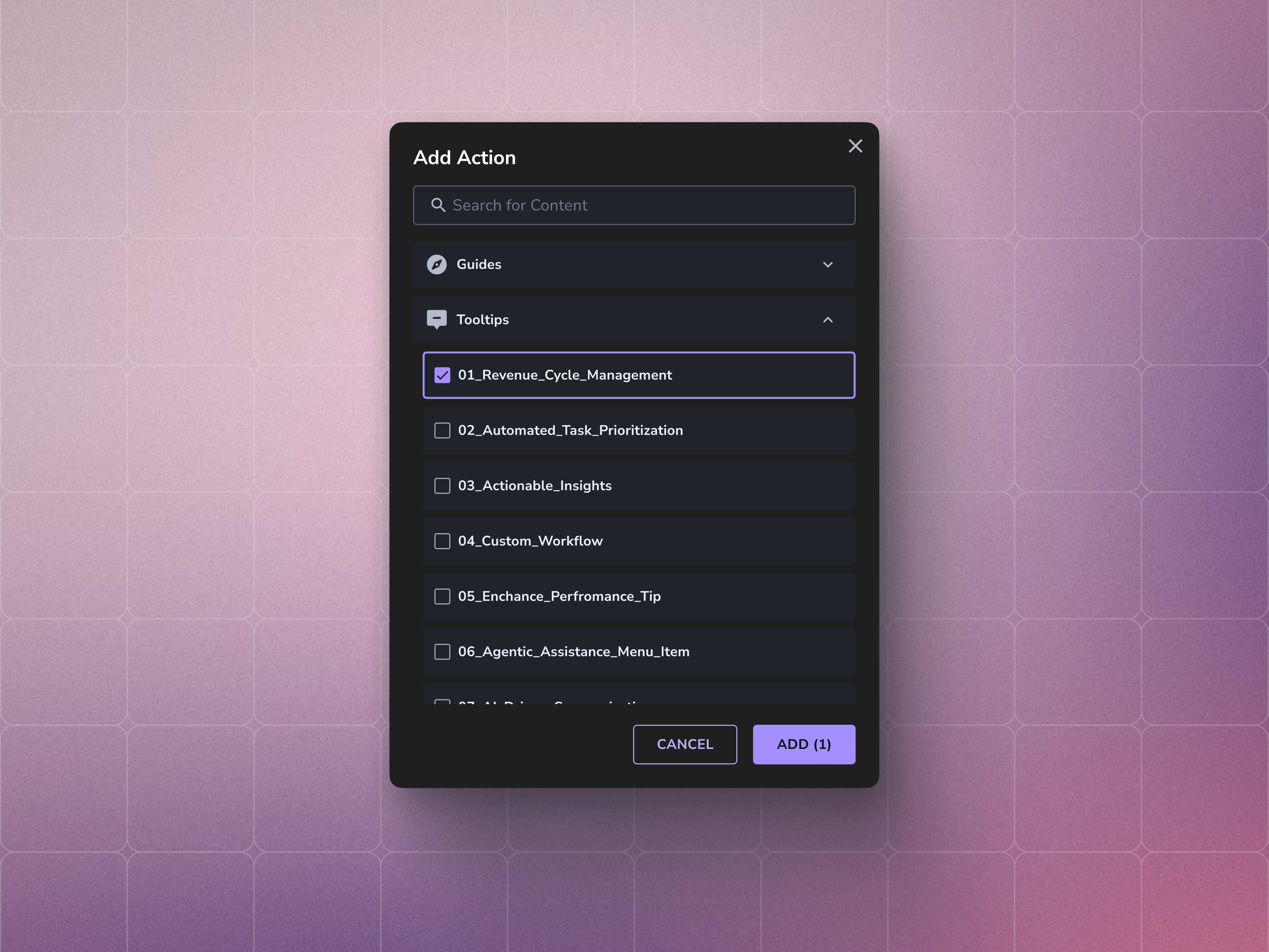
Select-content modal: assigns existing Guides, Tooltips, or Tags as actions on a context match.
Outcome
The feature shipped into development with positive early feedback from both Customer Success teams and enterprise customers.
Because the feature was still in development, feedback came through closed demos and Customer Success conversations rather than live usage data. Several enterprise customers immediately understood the value during walkthroughs, particularly around reducing repetitive manual guidance work inside complex systems.
Longer-term adoption and behavioural metrics are still being collected and will help shape future iterations.
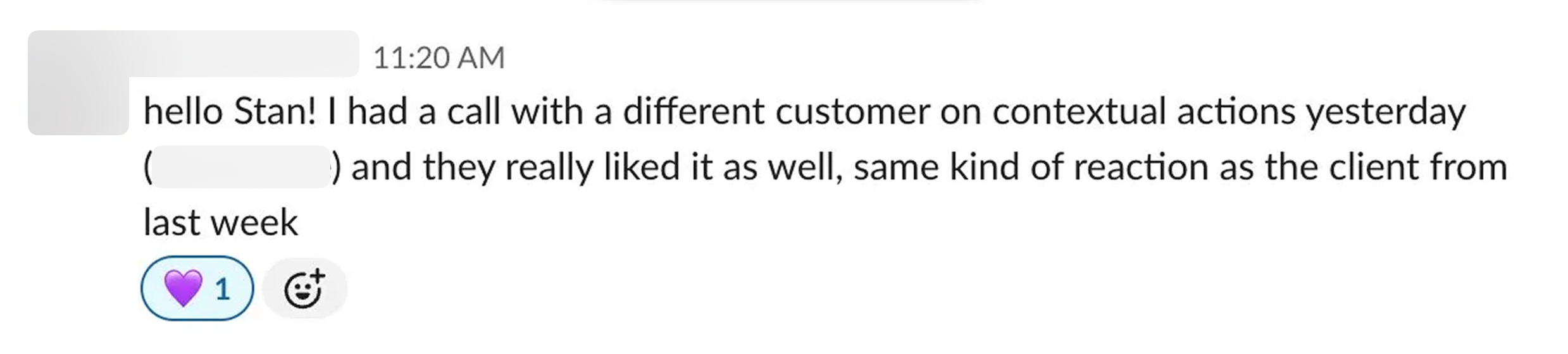
Great news from Product manager
Reflection
Two areas stood out in retrospect.
Design System Debt
The Editor still carried legacy UI inconsistencies from older implementations. Because many components were historically coded directly into product surfaces instead of pulled from a shared system, visual drift appeared during implementation.
We addressed visible issues where possible, but the underlying cleanup requires dedicated investment beyond this project.
Demand for Advanced Logic
Some enterprise customers quickly asked for more advanced condition systems – nested logic, chained behaviours, and more complex rule structures - we intentionally avoided that in the MVP.
The team chose a constrained model that stayed understandable for non-technical users rather than introducing flexibility too early. That tradeoff felt right for the stage of the product, but it also created a clear signal of where the product may need to evolve next.